Overview Research Ideation Prototyping Design Reflection
Back
App Design · AI-Assisted Build

Alienation

Galaxies apart? Not on this app. A world-building game where family members create their own characters, earn coins, and grow a shared planet that keeps them connected.

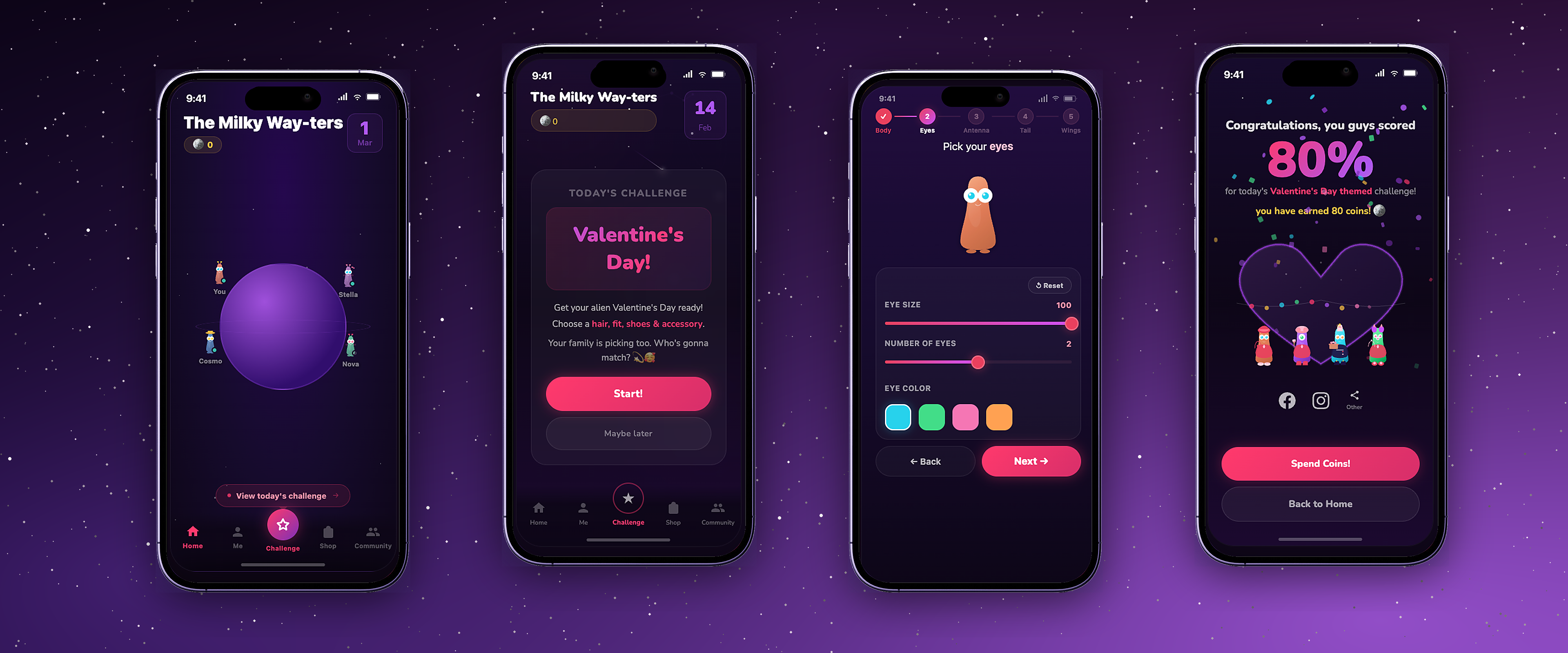
Alienation app screens: the family planet, today's challenge, the character customizer, and the family score reveal
Role Product Manager, Product Designer
Duration 6 weeks
Tools Figma, Claude Code
Team Sonali Chandy & Eve Fan
Skills
AI-Assisted Prototyping 🧭 Problem Framing 🔍 UX Research 🗺️ Product Strategy

Keeping families close when they can't be in the same room

Families who live apart don't fall out of touch on purpose. The group chat goes quiet for a week, nobody is free at the same hour, and the video call slowly turns into something you schedule instead of something you look forward to.

So we built Alienation, a daily family check-in hiding inside a game. Everyone designs their own alien, and all of those aliens live together on one shared planet. Each day there is one small thing to do: dress your alien for today's theme. Nobody gets to see how it turned out until the last person has played.

A brainstorm board mapping every kind of family that lives physically apart. Sticky notes branch out from a centre card reading Families who are Physically Apart into split families, military families, long-distanced married couples, grandparents, international students, blended families and parallel generations living across borders, several of them carrying vote stickers.
Topics we were exploring around family connections across distance.

We started with families where one parent is always travelling

To understand this family dynamic better, we spoke to 8 people across 3 groups: children who grew up with a parent on the road, travelling parents, and the stationary parents who stayed home with them.

We went in assuming that families where one parent travels a lot would want more time together and miss the family bond. Both groups corrected us, but they did it in completely different ways.

The parents

Blunt, and completely logical once we sat with it. They talked about logistics and load.

"Looking back, it was taxing and tiring to call. At the end of the day you just want to wind down and sleep." Michelle, travelling parent
"When my husband came back from his travels, yes we would miss him, but it always felt like it messed up the routine we had going on." Sarah, stationary parent

The children

Something different entirely. They talked about absence, and about waiting for the weekend.

"When my body started changing during puberty, I didn't know who to talk to; I couldn't really talk to my mom about it." Jackson, child of a travelling parent
"My mom was the 'disciplining' parent since she was home, so my dad was kind of the neutralizer, and I would always look forward to him returning." Abinash, child of a travelling parent
An email a child sent to her travelling father in 2012, subject line SSSSSSAAAAAADDDD AND UNHAPPPY, filled with rows of sad-face and heart emoji.
One of the people we interviewed still had this in her inbox, sent to her dad in 2012 while he was away.

After the interviews we put every quote on a board and moved them around until we discovered common themes. We used this to aid our ideation process further and look for gaps which we could fill.

An affinity map of interview quotes grouped under headings including Traveling parent's absence during the weekdays, Weekends as moments for reset, Burden on the stationary parent as the villain, and Takeaways from Travels.

Our assumptions vs. the realities

These themes also revealed a valuable contrast with our initial assumptions, which opened up our ideation even further.

What we assumedWhat we heard
Families want to spend as much time together as possible while apart.
The long calls felt tiring for the travelling parent after an exhausting travel work day.
The stationary parent is burdened with responsibilities while the other is away.
The travelling parent coming home messes up the routine everyone else had settled into.
Homecoming is filled with joy and happiness.
The travelling parent arrives exhausted, and feeling like the "odd one out."

We also looked at what other products existed in the market and what families already keep on their phones. Many options surrounded logistical planning, things like location tracking or shared calendars. We wanted to think out of the box on what we could create in this saturated space.

A family location-tracking app on a phone, showing a map with a family member pinned at school, her battery level, an ETA home and buttons to message or call her.
Family trackers & alerts
There are dozens of them. They can tell you where somebody is, but never how they are doing.
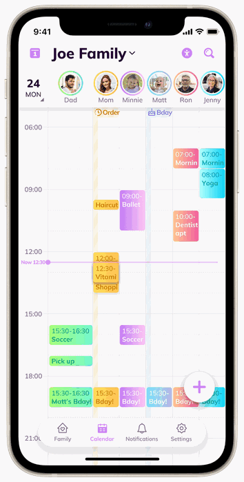
A shared family calendar app on a phone, with a row of family member avatars across the top and a day packed with colour-coded ballet, soccer, dentist and birthday entries.
Family calendars & organizers
A crowded category, and one more chore for whichever parent is already carrying the schedule.
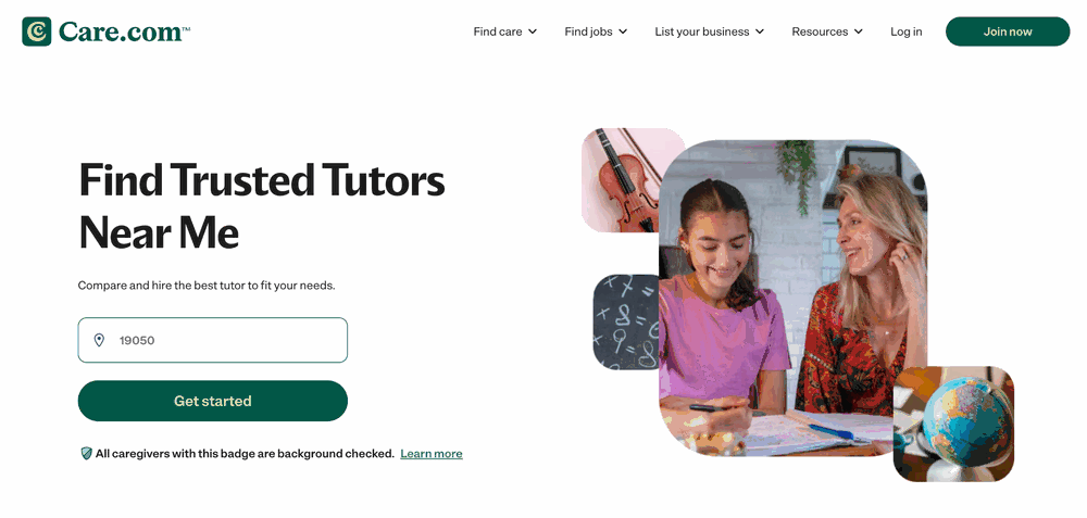
The Care.com website, headline Find Trusted Tutors Near Me, with a postcode field and a Get started button.
Niche help-finding apps
More need-basis and only used by parents who do not have access to immediate help.

How Might We

create a low-barrier, playful shared experience that bridges the emotional gap between traveling and stationary family members?

Brainstorming

We explored a wide range of topics, covering everything from calendars to messaging systems to parental controls, but felt that everything touched too closely on existing products.

A board of green sticky notes holding app ideas, including a homecoming countdown calendar, a time-released messaging system, a lovebox-style app, and an app where the family keeps a shared plant alive, several carrying vote stickers.

Landing on our idea

After looking at our competitors and initial brainstorming, we decided we wanted to make a fun, thematic alternative to what already existed. We knew these were some of the features we wanted to include:
A unique base environment. A place where everyone has some sort of character and exists together, rather than a feed to scroll or a thread to answer.
Minimal time spent, maximum effectiveness. If you have a minute, you log in, do your bit and go. We realized that different family members have different time commitments.
Combined effort for the family. Nothing moves unless everyone contributes, so the small things each person does add up into something the family owns.

We also brainstormed features and categorized them into must, should, could and won't. After visualizing our features, we realized that we were shifting towards a game-like product instead of a utility app.

A MoSCoW prioritisation board with columns for Must Have, Should Have, Could Have and Won't Have. Must Have includes a base environment and daily challenges; Won't Have includes calendar and calling or voice interaction.

Initial Prototypes

Since we wanted something cute and thematic to keep the whole thing fun, we landed on a space theme with alien characters living on a shared planet. We started by drawing out our ideas, then proceeded to lo-fi mockups with Figma. We used these to test and get feedback on the flow through an iterative process.

A hand-drawn paper sketch of the first flow, with frames for Create Family, Name Family, Character Customization, a galaxy homeland showing numbered days, and a Yay Family screen with four aliens.
First sketch of the concept, where users can create their own character and add their family members.

We wanted to get through as many rounds of feedback as we could with our lo-fi Figma prototypes, so we went through 5 rounds of iterative user testing to figure out the user flow.

Six lo-fi screens in a row: picking an outfit, shoes and an accessory, confirming your final look, the family grid showing who has completed the challenge with a nudge button, and the results screen with a score of 80 and a shareable family photo.
The first flow we prototyped for the main game component.
Written summaries of the lo-fi user testing rounds, each paired with the wireframes tested and before-and-after comparisons, plus photographs of participants clicking through the prototype on a laptop.
Every round written up the same way, so the notes could be compared rather than just collected.
The full Figma canvas of lo-fi frames, five rows of screens covering onboarding, building the planet, adding family, the daily dress-up challenge, the waiting and submitted states, and the shop.
We did a total of 5 rounds of testing, iterating along the way to figure out the entire flow, from character creation to a single day's activity.

Designing with AI

For the look and feel of the app, we prompted Claude that we wanted a dark, space galaxy theme.

After the first round, the legibility was poor and the design felt a little flat, so we asked for more pink to pop out and really tie into the space pop theme. Each pass taught us to name the exact change we wanted instead of describing a vibe.

01 · What we gave it The greyscale Figma wireframe of the daily challenge screen, with plain grey boxes for the artwork and buttons.
The initial Figma wireframe to visualize the layout, concept, and flow.
02 · First pass The first AI-generated version, dark purple with a pink gradient button, but very low contrast throughout.
The first version we got, but the legibility was poor and the whole thing felt flat. The icons were also inaccurate.
03 · Where we landed The final version, higher contrast, a solid pink call to action, and a legible navigation bar with labels.
So we asked for more pink to pop out, stronger contrast, and a navigation bar with the correct respective icons.

We also needed a base character that everyone could customize, so we turned to Claude again, starting from references and correcting the shape across a few rounds until it felt like ours.

01 · What we fed in

We started by feeding Claude similar images and characters of what we were going for. Something nostalgic, but also friendly looking.

A reference board of cute character art collected as inspiration: the Doodle Jump alien, Pou, Sumikko Gurashi, Kakao Friends, the Duolingo owl, Tiny Planets, and sets of friendly one-eyed monster illustrations.
02 · The first pass

What came back first was simple. One shape, one colour each, and a single eye. We still felt the characters were too flat, and we wanted a more fluid shape.

Four early aliens side by side, each a flat rounded shape in a single colour: blue, green, purple and orange.
03 · Final base character

After a few rounds of prompting, we arrived at our final base character. We asked for an onigiri-like shape so it would have a silhouette of its own.

Three purple alien body shapes side by side, labelled A Compact Onigiri, B Standard Onigiri and C Tall Onigiri, each with a note about how much outfit and shoe room it gives.

After we got the theme and characters right, we then proceeded to convert all of the wireframes, iterating continuously until every screen matched the vibe, and fixing bugs that came up during our sessions.

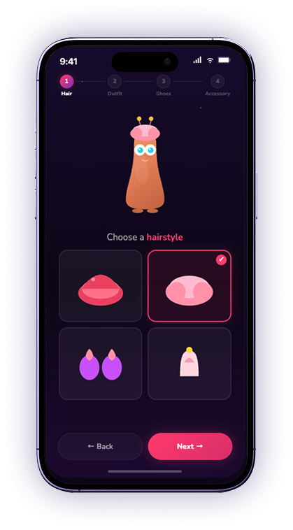
01. Character Customization

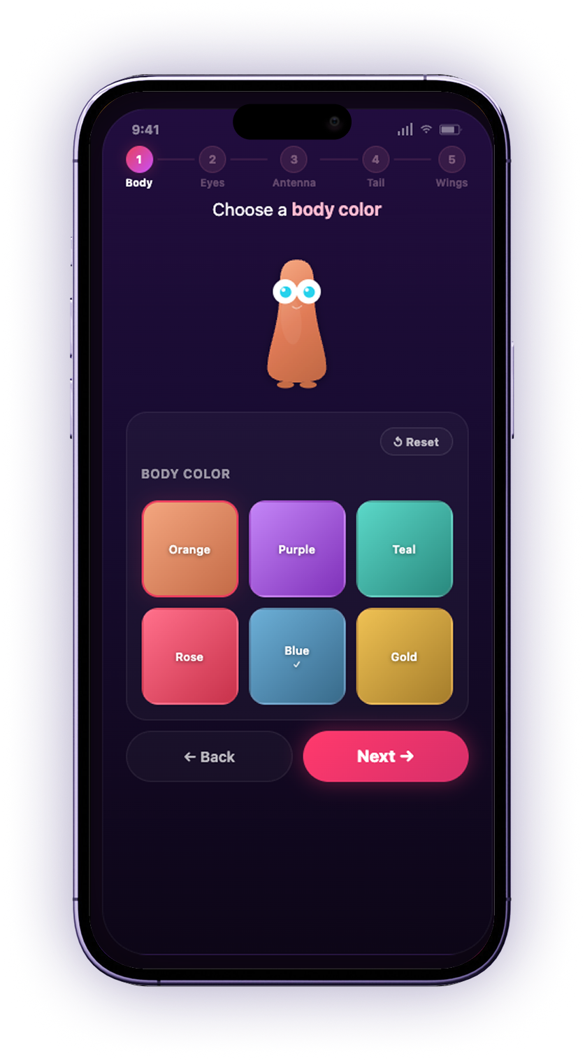
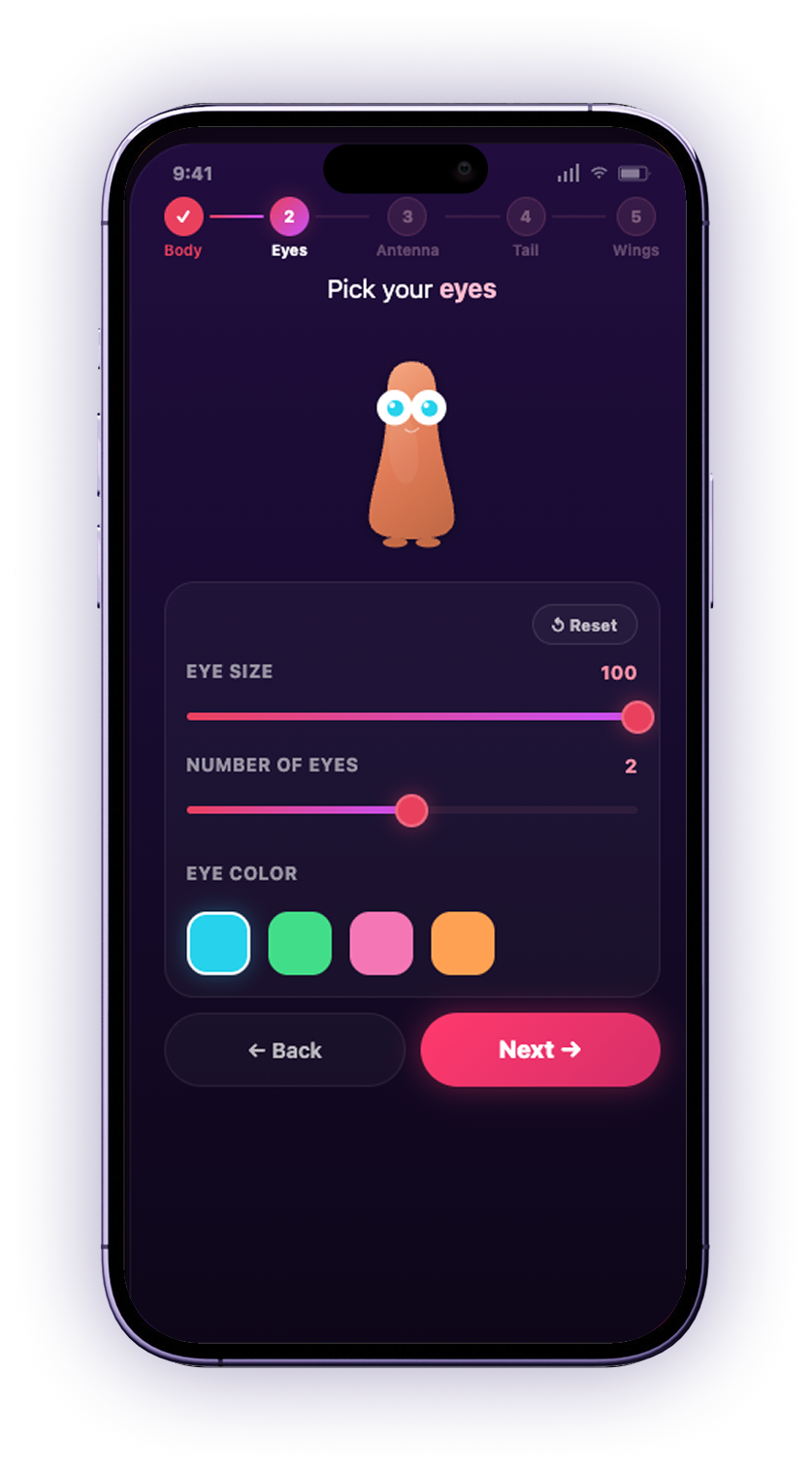
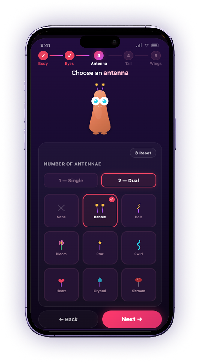
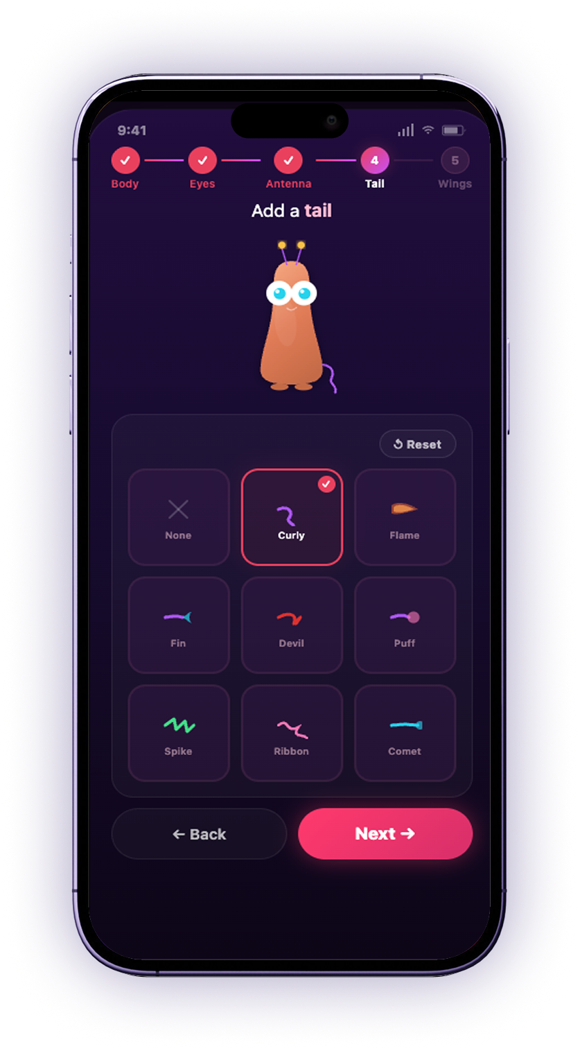
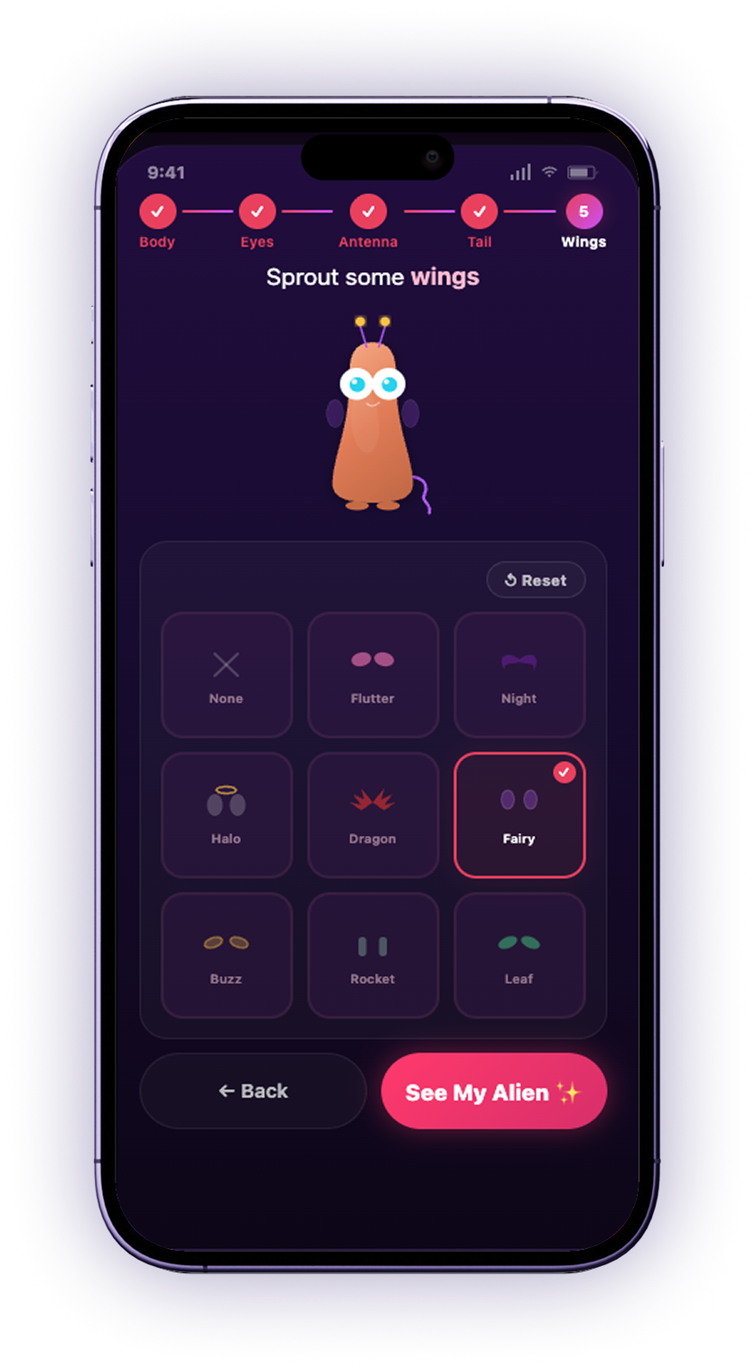
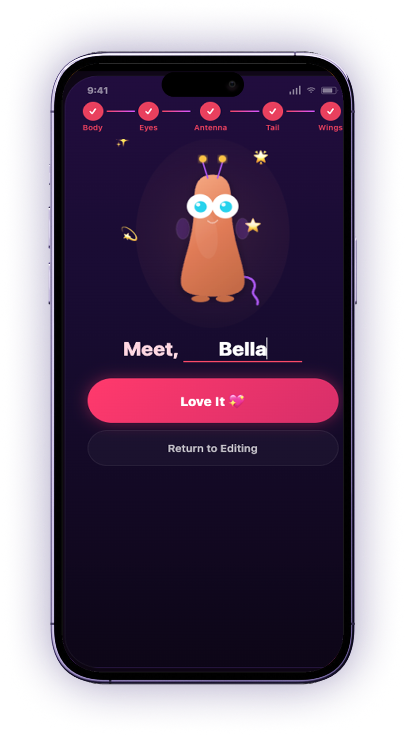
Users can first choose and customize their own alien, stepping through the body, eyes, antennae, tail and wings, then naming what they made.

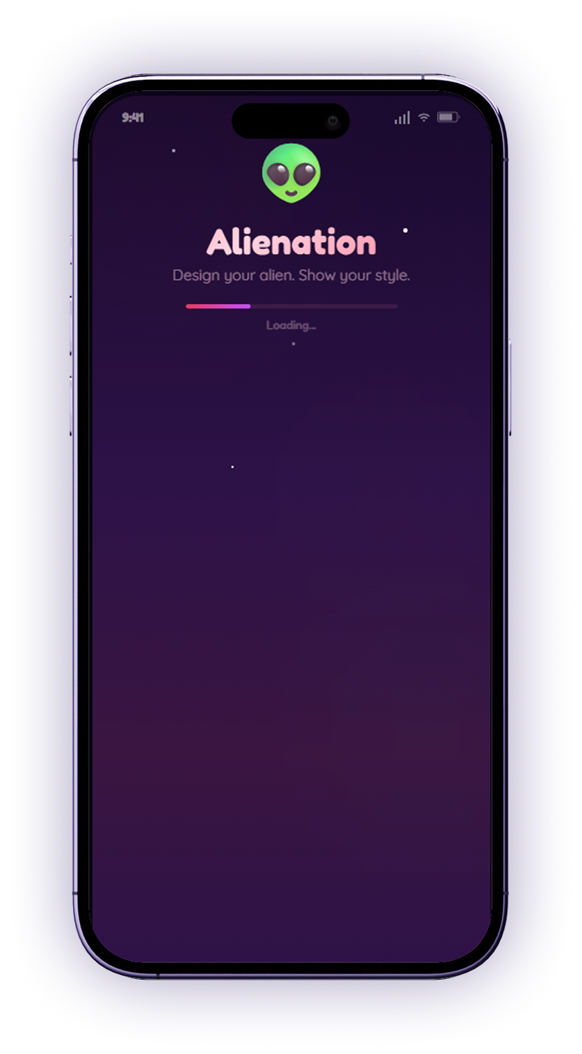
Alienation splash screen

Splash

Choosing a body colour

Body

Picking your eyes

Eyes

Choosing an antenna

Antenna

Adding a tail

Tail

Sprouting wings

Wings

Naming and confirming your alien

Reveal

02. A unique base environment

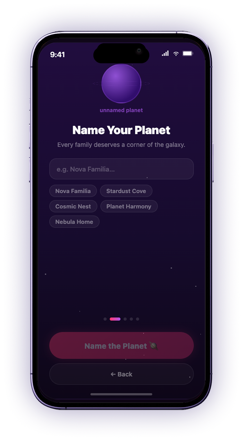
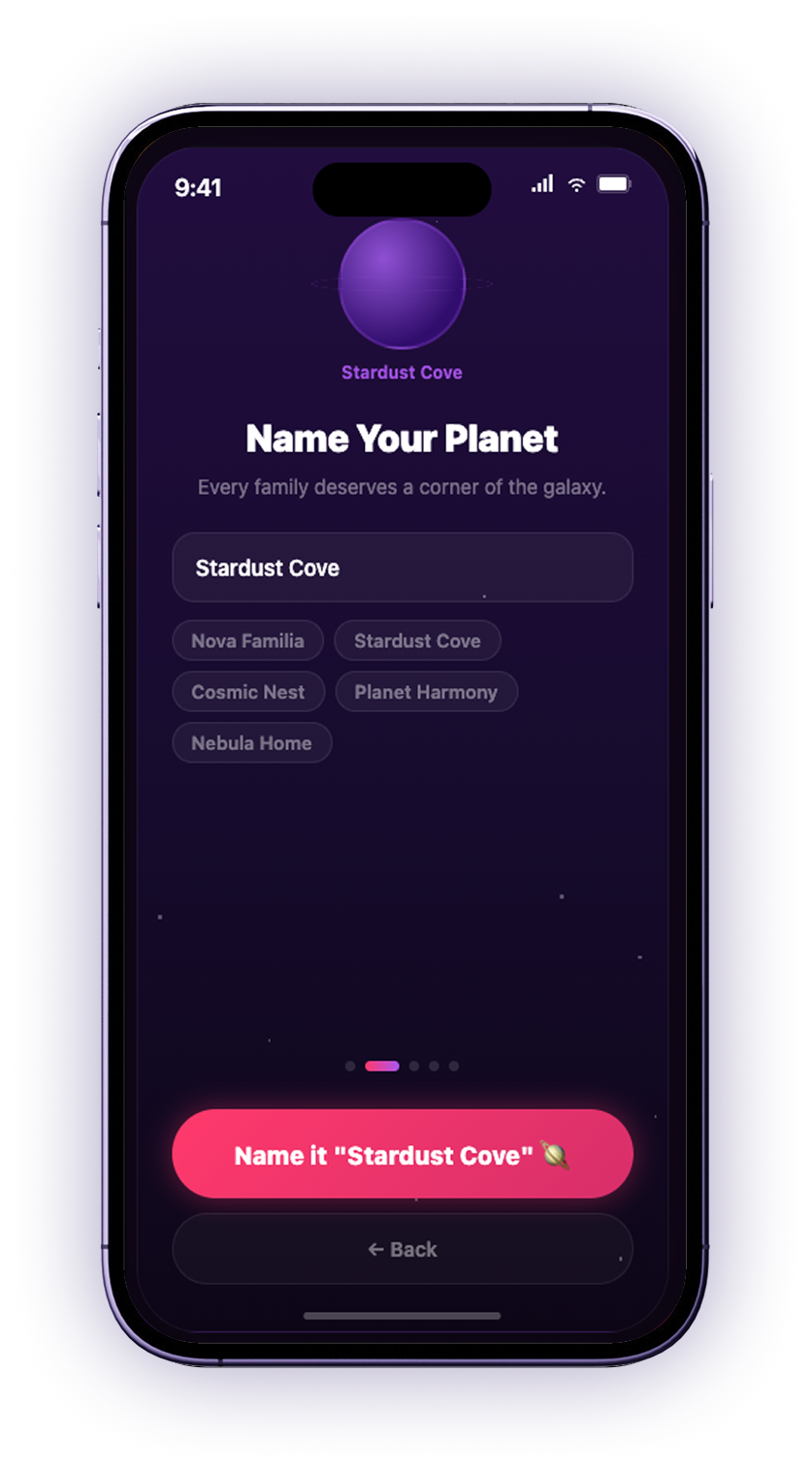
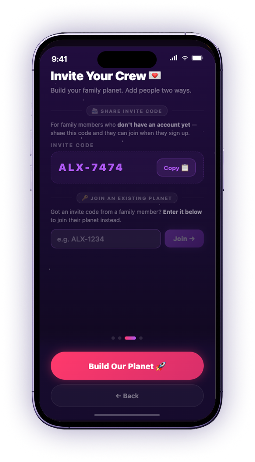
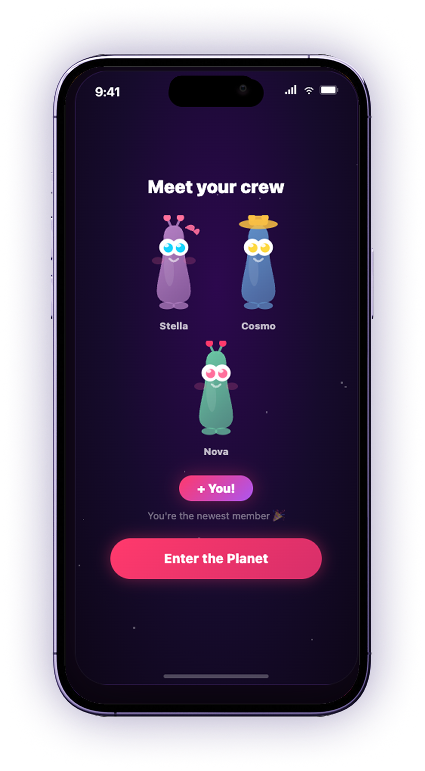
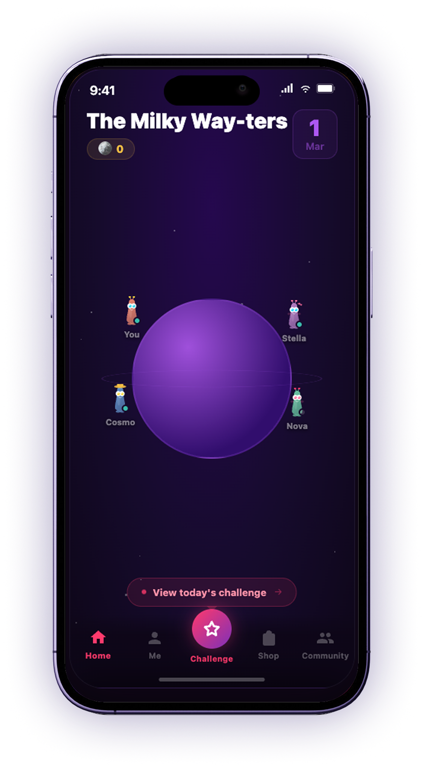
Every family gets its own corner of the galaxy, and the aim is to build it up by checking in each day to do the challenge. The first user would name the planet, then pull everyone else onto it with an invite code.

Name it

Name it

Confirm

Confirm

Invite

Invite

Meet the crew

Meet the crew

The family planet home screen, titled The Milky Way-ters, with You, Stella, Cosmo and Nova orbiting the planet and a button to view today's challenge

The planet

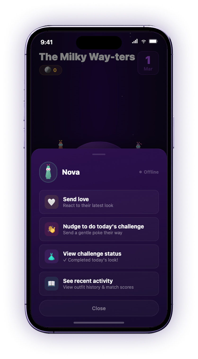
A family member's sheet on the planet, showing Nova offline with options to send love, nudge them to do today's challenge, view their challenge status, or see recent activity

Family member

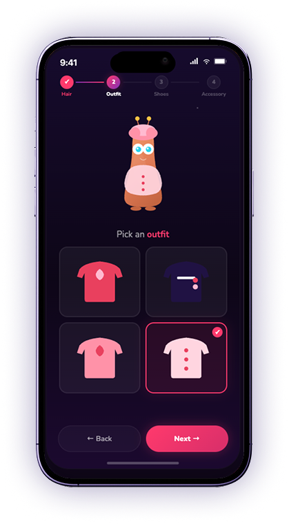
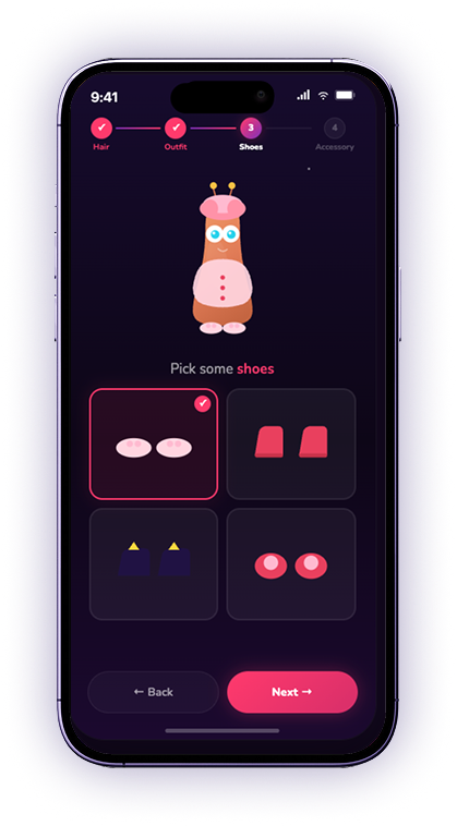
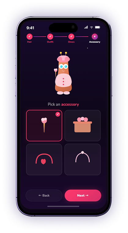
03. The daily dress-up challenge

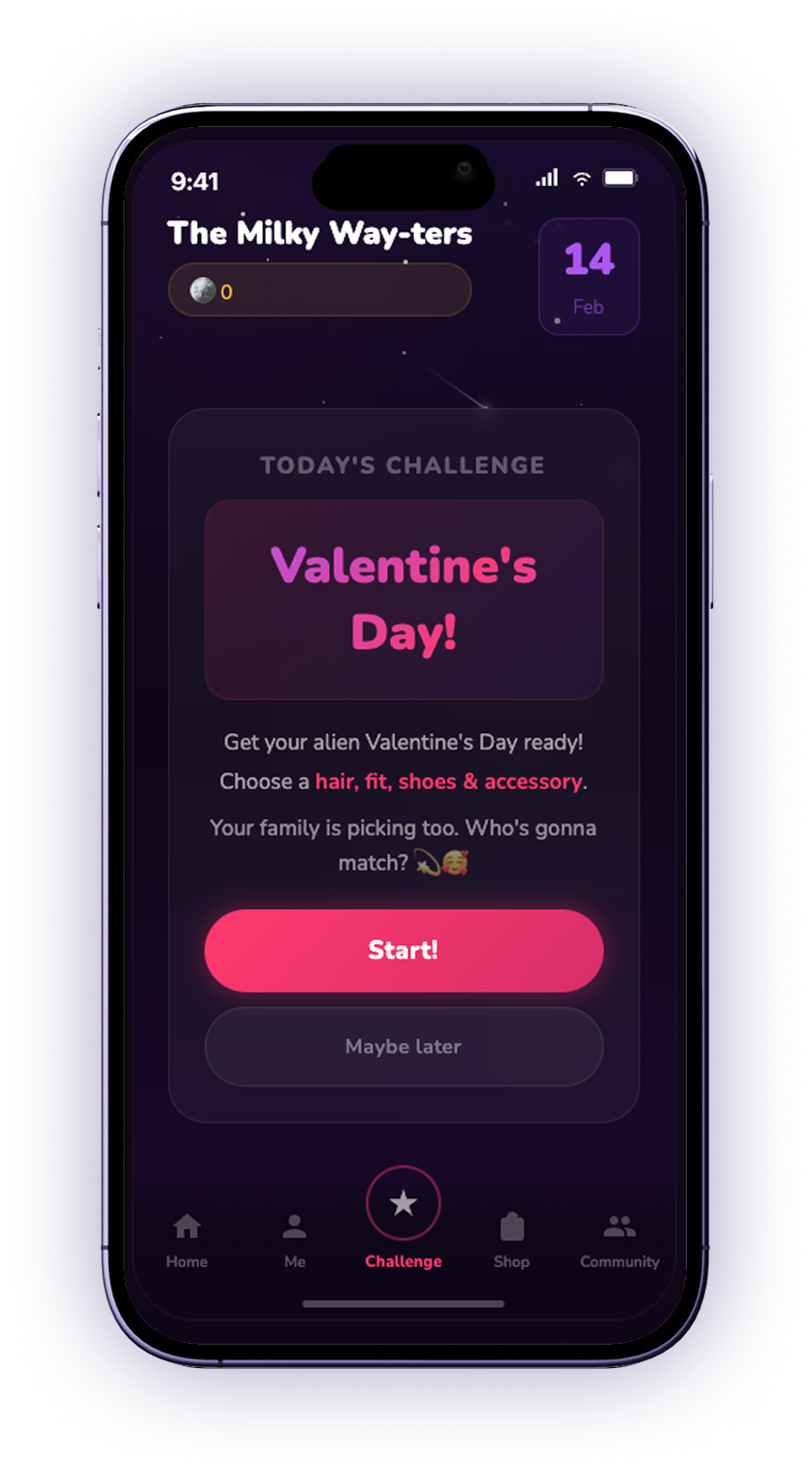
Every day brings a new theme. Everyone dresses their alien in what they think the rest of the family will pick, matching as many of them as possible.

Today's theme

Today's theme

Hair

Hair

Outfit

Outfit

Shoes

Shoes

Accessory

Accessory

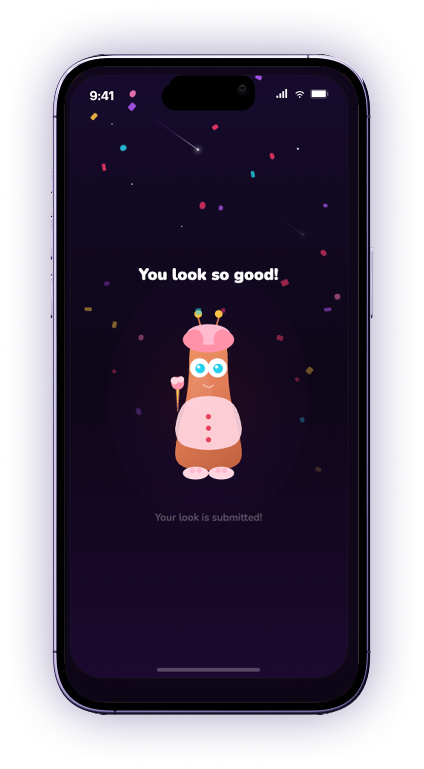
Submitted

Submitted

04. Reveal and scoring

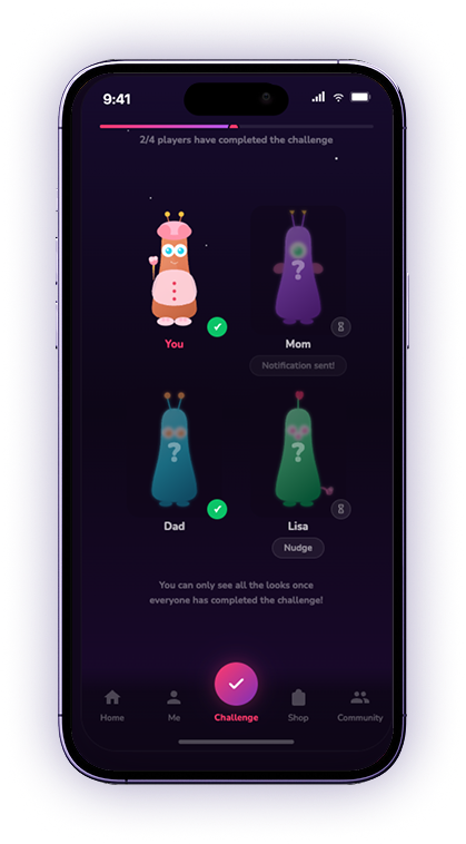
Everyone's choices stay hidden until the last person has submitted, which encourages every family member to keep up the daily streak and show up for each other. Users can also nudge whoever is holding it up with a notification.

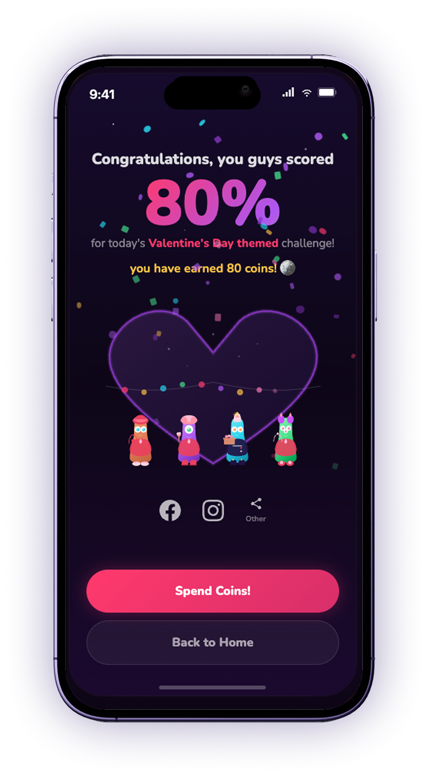
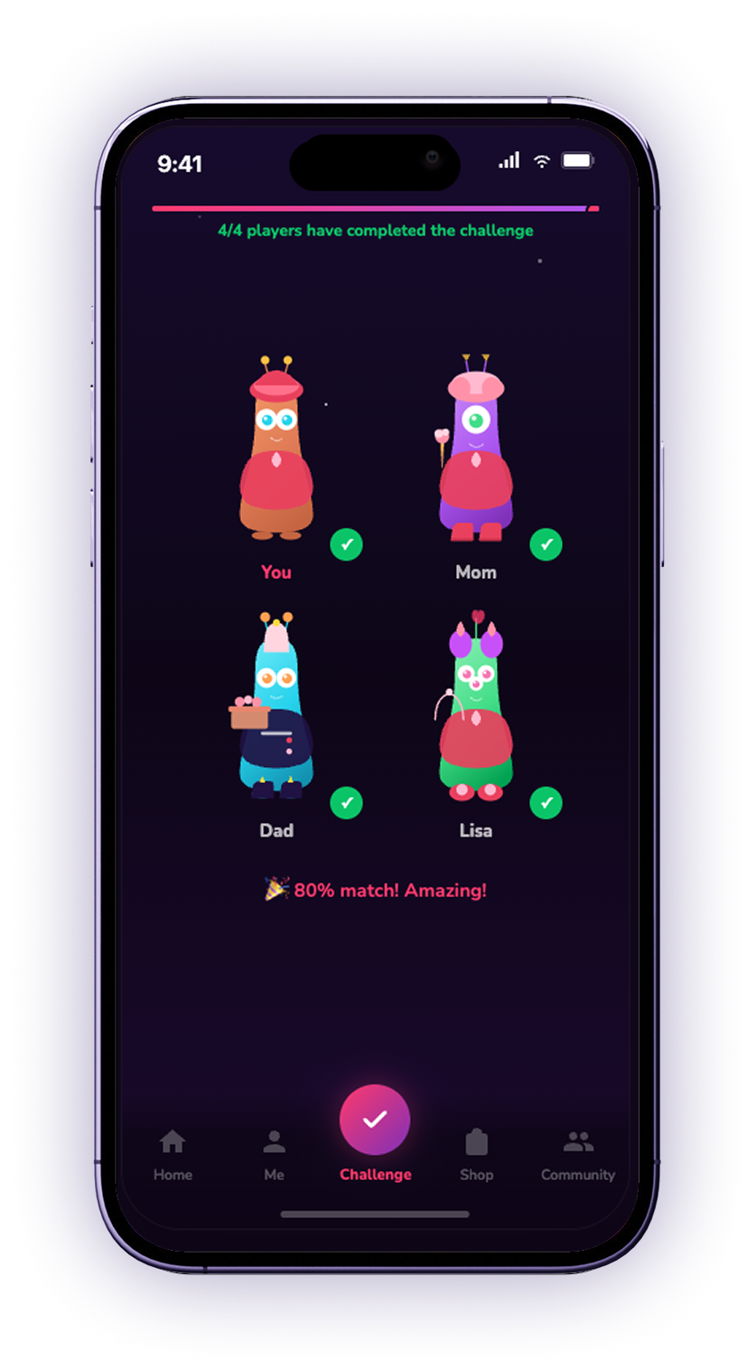
Once everyone has played, the looks are revealed together as a family photo day, ready to share. Each item is then scored against what everyone else picked, and those matches add up to a score that pays out as coins.

The waiting state: 2 of 4 players have completed the challenge, with Mom and Lisa still hidden behind question marks and a Nudge button beside each of them

Nudge

The full reveal: 4 of 4 players have completed the challenge, every alien's look now visible, and an 80% match result

Full reveal

The results screen: Congratulations, you guys scored 80% for today's Valentine's Day themed challenge, 80 coins earned, the four aliens inside a heart, and buttons to share to Facebook, Instagram or elsewhere

Score & share

05. The shop and building your world

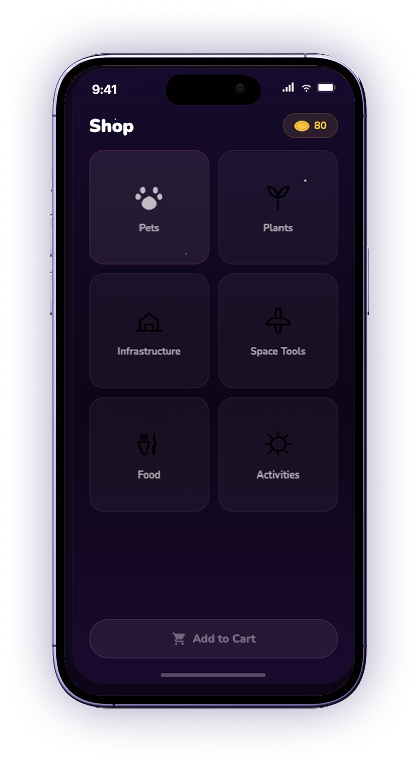
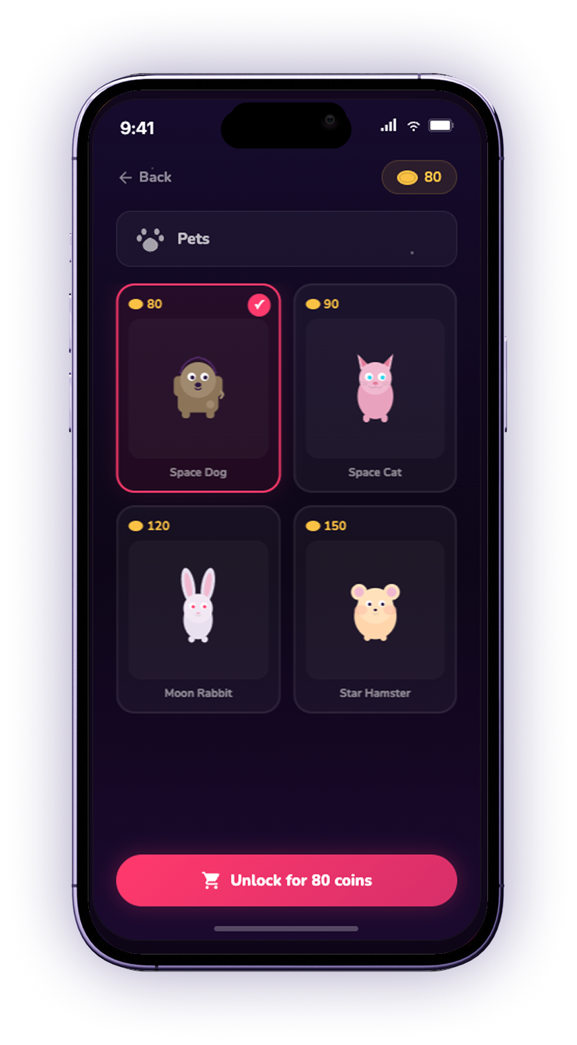
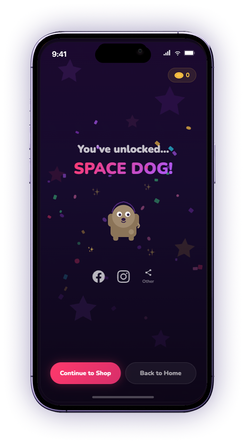
Coins from each day's challenge are spent in the shop, where families expand their planet with pets, plants and buildings. A streak slowly turns into a place the family built together.

The shop, with categories for pets, plants, infrastructure, space tools, food and activities

Shop

The pets category, showing Space Dog, Space Cat, Moon Rabbit and Star Hamster with their coin prices, and an unlock button

Pets

The unlock celebration screen for Space Dog, with confetti and buttons to continue to the shop or head back home

Unlocked

Why the design works

Family apps are oversaturated with calendars and trackers, so going the other way made ours playful and low-pressure. On the planet, nobody is the person who is away, and that reaches past families to friend groups and long-distance couples.

Looking back, vibe coding the hi-fi got us to something clickable far faster than we could have built by hand, so we were testing a real interaction instead of a static flow. Prototyping in Figma first was what made that possible. The wireframes became a clear blueprint we handed to Claude Code, so every prompt could point at a concrete screen and state instead of describing one from scratch. This made our entire iterative testing and feedback process much easier.

Next Project

Improving Path@Penn →

Redesigning class registration at the University of Pennsylvania.